Post #3 Final Graphic Design

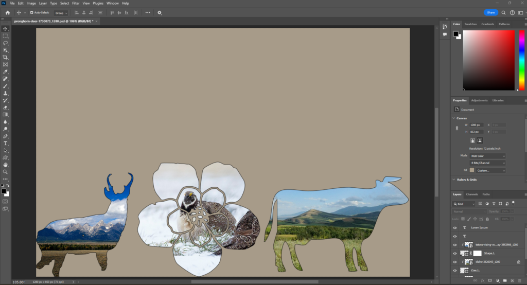
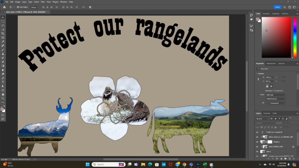
Above is my first draft for my final graphic design project. When I left off I had the three different shapes masking images of different rangeland related images. My background was that plain tan color because I wasn’t exactly sure what I wanted to do with it yet. In my previous post I had mentioned that for my final draft I would like to add text. I thought that adding text would make the project complete. However after adding my text into the image, I was still not happy with the product. Below my second version with no background and just text can be seen.

As you can see it was pretty boring. While it met the three images requirement I did not feel like this should be my final version of my project. I played around with quite a few effects. I thought that maybe adding texture or style to the text itself would help however that did not give me the result I wanted. But on my journey looking through text effects on youtube I found this awesome video on how to texturize your text to look like grass!
I decided to go back and re-read my peer suggestion to try and find some more direction for my final product. The only suggestion was that I maybe blend the three images into one animal instead of having the three different shapes. I liked this idea but wasn’t sure I wanted to get rid of all the shapes. Well during my time shifting the images around I accidentally created A final product I was happy with!
Before posting my final images I wanted to review some of the processes I used and learned throughout this journey.
The main videos for the first iteration of my draft are below https://www.youtube.com/watch?v=aYl4YZPKwTI and https://www.youtube.com/watch?v=GnlD-kxfyXk
In my new version I mainly used youtube to figure out how to edit text. I found a fast and simple video that showed me how to curve text which I think was a simple way to add some good symmetry to my project.
Here is the video on how to curve text! – https://www.youtube.com/watch?v=jLAJURzFheE

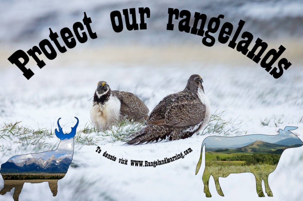
This is my final draft of my graphic design project. The most notable changes I made are the text and the flower. I got rid of the flower because I did not feel like it was flowing well with the theme I had in my head. When I read my peer suggestion that said to blend the images I thought this was a nice compromise. There are less shapes in the image but I felt that having the sage grouse be the back ground image instead of inside of the shape really gave the project a nice focal point. I still kept the cow and pronghorn shapes because they give a nice contrast to the white back ground. Having a shape on either side of the grouse added some nice symmetry to the image as well. Overall I felt that adding the grouse as my background image made it way more visually pleasing than my previous tan one. Grouse are also a rangeland ecosystem icon and are the focus of many rangeland related issues presently. I felt that making them the center of the project was a nice nod towards sage grouse habitat work in the West!
For the text I decided to keep it simple. I wanted to garner attention to my website to raise awareness about rangeland issues and to raise funds for rangeland habitat projects. So I just went with “Protect our rangelands” in an arching shape that formed over the top of my focal points in the image. Below the sage grouse I also put in “To donate visit WWW.Rangelandlearning.com”. This way people are able to see the visual then have clear directive on how they can help!
I sourced all three of my images from https://pixabay.com/ ! They are publicly available images that can be re-used anywhere!